Society and economy
Isotype was forged in the optimism of the first Austrian Republic. It was developed from 1924 at the Social and Economic Museum of Vienna, where it was first called the Vienna Method of Pictorial Statistics.
The Social and Economic Museum was funded by the Social Democratic municipality of Vienna and shared its socialist agenda. It was not what is usually thought of as a museum: its director Otto Neurath stated that instead of a treasure chest of rare objects, it should be a teaching museum. The principal exhibits were charts made with the Vienna Method in order to 'represent social facts pictorially', as a way of communicating with both young people and adults.
The museum had a global-historical outlook, which it explored in publications designed to show the world's complex economic interconnections.
[2.01, 2.02]
Original charts showing the Isotype method
About 1933
In the chart 'Comparisons of quantities', the third example corresponds to Isotype. Its repeated units allow for more precise judgements to be made about relative proportions than are possible from the first two examples. The units (squares) of the third example are then replaced by pictograms such as those shown in the second chart, and assigned a certain value.
Linocut and letterpress prints pasted onto paper, then mounted on plywood
Produced by the Mundanaeum Vienna
The identity label of the Isotype Institute added later
[2.03-2.07]
Original charts made for exhibiting in London
About 1933
These charts were produced by the Mundanaeum, an international affiliate of the Social and Economic Museum. They were made in Vienna and shipped to the Mundanaeum's London office for display. Hand-crafted from printed elements, the charts are among only a few surviving originals of this kind. Their sizes adhere to the museum's modular framing system, emulated by this fitted array.
Linocut and letterpress prints pasted onto paper, then mounted on plywood
Produced by the Mundanaeum Vienna
[2.08, 2.09]
The Colourful World (Die bunte Welt)
1929
This was the first book conceived entirely with the Vienna Method of Pictorial Statistics. The use of colour was expensive, but it was considered important for making the charts informative and attractive. The book was aimed at older children in order to broaden their horizons beyond central Europe.
Vienna: Artur Wolf
Charts from Society and Economy (Gesellschaft und Wirtschaft)
1930
This selection from a folder of 100 charts marks a high point in the first phase of Isotype. Here, with the full involvement of Gerd Arntz, the method of graphic design reaches maturity. Society and Economy is a kind of atlas, suitable for use in schools. Its loose-leaf pages allow the charts to be shown alongside each other and compared.
Leipzig: Bibliographisches Institut
Each chart is identified by a number in its lower right corner.
[2.11]
Chart 13: 'Ancient American cultures around 1500'

Each figure represents 2.5 million people.
[2.12]
Chart 21: 'US: population' 

Each figure represents 5 million people.
[2.13]
Chart 23: 'Powers of the Earth' 

Each figure represents 25 million people.
[2.14]
Chart 32: 'Import trade to west and central Europe'
[2.15]
Chart 45: 'Development of rubber production since 1895'
Green tyres represent 25,000 tons of wild or cultivated rubber, and orange tyres represent the same amount of recycled rubber. This chart is partly a comparison between the data on the left of the central axis (North and South America) and that on the right (the rest of the world).
[2.16]
Chart 46: 'Rubber economy of the Earth'

Solid green tyres on boats represent 25,000 tons of rubber produced and exported; hollow green tyres on boats represent 25,000 tons of rubber imported; solid orange tyres represent 25,000 tons of recycled rubber produced and used in the same area.
[2.18]
Chart 54. 'Oil-fired ships in merchant navies of the earth'

Each ship represents 1 million gross register tons (100 cubic feet of a vessel's interior volume]; green = oil-fired steamships and motor-ships; brown = coal-fired steamships; blue = sailing ships.
[2.19]
Chart 55. 'Merchant navies of the earth'

Each ship represents 5 million gross register tons (100 cubic feet of a vessel's interior volume).
[2.17, 2.20-2.26]
Charts from Society and Economy (Gesellschaft und Wirtschaft)
1930
Selection from a folder of 100 charts that marked a high point in the first phase of Isotype. Here the method of graphic design reaches maturity. A team of consultants, including cartographers, historians and others, was specially employed by the Social and Economic Museum for this publication. The loose-leaf pages allow the charts to be shown alongside each other and compared.
Leipzig: Bibliographisches Institut
Each chart is identified by a number in its lower right corner.
[2.20]
Chart 56: 'Number of motor vehicles on the Earth' (USA and rest of the world)

Each car represents 2.5 million vehicles.
[2.21]
Chart 57: 'Development of the railways'

Each segment represents 50,000 kilometres of rail track.
[2.22]
Chart 70: 'Rome'

Each human figure represents 100,000 inhabitants.
[2.23]
Chart 71: 'New York'

Each human figure represents 100,000 inhabitants.
[2.24]
Chart 88: 'Strikes and lockouts'

Each fist represents 10 million workdays lost.
[2.25]
Chart 92: 'Infant mortality and income'

Each coffin represents one death in the first year of life for every ten births; each circle represents 100 marks annual income per inhabitant (1929). The poorest region, with the highest mortality rate, is French West Africa.
[2.26]
Chart 97: 'Economic forms of the Earth'

Each human figure represents 100 million people (estimate for 1930): cog wheel = modern economy (industry in foreground); hammer = ancient culture economy (developed handcraft and agriculture/farming); bow and arrow = primitive economy (hunter-gathering, primitive agriculture).
[2.17]
Chart 51: 'Hydro-electric, coal and oil energy in Europe except the USSR' (rounded figures for an average of recent years, before 1929).
Each pictogram represents 10 billion kilowatt hours used per year: burning coal brick = coal-fired; burning oil can = oil-fired; blue spiral with red lightning = hydro-electric; blue wave = not yet exploited hydro-electric power.
[2.27-29]
The Social and Economic Museum of Vienna
1925-34
The museum's principal exhibition space was located in the New Town Hall of Vienna; its entrance is indicated by an arrow in the illustration of the building's façade. The first photograph shows the exhibition space in the New Town Hall, with framing apparatus and lighting designed by the architect Josef Frank. The second photograph shows the museum's smallest exhibition space, at a street-corner showroom of the Viennese Municipal Insurance Service in the heart of the old city.
[2.30]
Outline of the Vienna Method of Pictorial Statistics
1926
This reproduction shows the first published explanation of the Vienna Method. It contains many essential principles of form and colour that remained integral to Isotype. The general aim is stated as the 'schematic emphasis of essentials by means of a picture-script of hieroglyphs understandable to all, which can be used as international pictograms'.
From Otto Neurath, 'Bildliche Darstellung sozialer Tatbestände', Aufbau, vol. 1, no. 8/9, 1926
[2.31-2.34]
Successive charts about human groups/races of the earth
1926-30
These progressive redesigns of a single chart show the graphic and technical progress of Isotype during its first five years. Pictograms were initially made from cut paper, then they were drawn, then made from linocuts. The progression of redesigns also reveals changes to the pictograms, and the gradual elimination of intrusive backgrounds and framing devices. A footnote to the second version states: 'The division of humanity into races is very controversial. This chart serves only the most general orientation.'
In each version of the chart one figure represents 100 million people.
[2.31]
Photograph of chart from Social and Economic Museum of Vienna, about 1926
[2.32]
From Bildstatistik: Führer durch die Ausstellungen des Gesellschafts- und Wirtschaftsmuseums in Wien, Leipzig: Dürerbund / Schlüter & Co., 1927
[2.33]
Print from Social and Economic Museum of Vienna, 1928
[2.34]
Chart from Gesellschafts- und Wirtschaft (1930) reproduced in Otto Neurath, Bildstatistik nach Wiener Methode in der Schule, Vienna & Leipzig: Deutscher Verlag für Jugend und Volk, 1933
[2.35, 2.37-2.38; not using 2.36]
Successive charts on the theme of relative birth and death rates
1926-8
These progressive variations on a single theme show a process of experiment during the early years of Isotype. The form and arrangement of the pictograms become less cluttered; an axis is introduced to emphasise when an unusual number of deaths occurred; and the orientation is changed from vertical to horizontal.
[2.35]
Unlabelled offprint of chart from Social and Economic Museum of Vienna, about 1926
[2.37]
Photograph of chart from Social and Economic Museum of Vienna, about 1927
[2.38]
From Otto Neurath, International Picture Language, London: Kegan Paul, Trench, Trubner & Co., 1936 (based on a German-language chart of 1928)
[2.39-40]
Health and safety information graphics
1927
From the beginning, Isotype was concerned with more than social statistics: the same graphic simplicity was applied to health and safety information. The leaflet for preventing industrial accidents (left) is titled: 'Protect your hair from the spindle!' The health notice (right) advises prompt treatment of tuberculosis, a common disease in 1920s Vienna. The educational strategy of Isotype to present comparisons graphically is brought into sharp focus in these two examples.
[2.39]
Print from Social and Economic Museum of Vienna
[2.40]
Off-cut from the Österreichischen Gemeinde-Zeitung, vol. 4, no. 9, 1927
[2.41]
Model of a laundry in a Viennese municipal apartment block
About 1930
This photograph shows an architectural model made in the workshop of the Social and Economic Museum. The museum produced various kinds of display material, particularly in connection with Vienna's programme of municipal housing.
[2.43-2.47]
Isotype 'Picture Dictionary'
1930-40
The 'Picture Dictionary' is the original working reference file of pictograms designed by Gerd Arntz in collaboration with Otto Neurath. The Social and Economic Museum's design guidelines stated that a pictogram 'should not contain more characteristics than are necessary to the statement of facts for which it is chosen.' These pictograms are the building blocks of Isotype and prefigure the pictograms used on today's public information signs.
Prints from linocuts and photo-engraved blocks, pasted on card
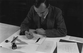
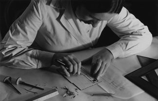
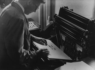
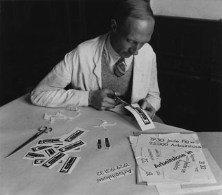
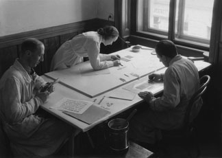
How Isotype charts were made
About 1930
These photographs show stages of the design and production of a chart at the Social and Economic Museum workshop. Gerd Arntz's pictogram design is cut in linoleum and then printed in multiple copies ready for cutting and pasting, along with typographic elements. Lino-cutting was a flexible and rapid way of making repeatable images (more so than photo-engraving or type-founding). It also enabled the whole process to be carried out in-house.
Photographs by Walter Pfitzner
[2.49]
Original drawings for Isotype pictograms
1933
These drawings by Gerd Arntz served as artwork for charts that showed sets of 'standard' pictograms produced by the Social and Economic Museum. These charts were issued by the Mundaneum in Vienna, perhaps as guidance for its foreign branches.
Gerd Arntz
Ink on paper
[2.50]
Chart showing the make-up of Austria's population (those commercially active, and those not)
1926
The pictograms in early examples of the Vienna Method retain a degree of naturalism. But the basic idea of letting them 'speak for themselves' is already present: the fur-collared figures in the first matrix depict people of 'independent' means. The figures were probably made by cutting paper with scissors.
Presumably each pictogram denotes a 12th of the whole population represented by each matrix of 12 units.
Offprint from Otto Neurath, 'Statistische Hieroglyphen', Österreichischen Gemeinde-Zeitung, vol. 3, no. 10, 1926
[2.51]
Chart showing increase of school meal provision by the Vienna municipality
1927
The design of pictograms as silhouettes emphasises their characteristic details. Soon after this chart was produced, tables of supporting statistics (as seen here in the lower right corner) disappeared from charts in the Vienna Method. A catchphrase of the Social and Economic Museum was: 'To remember simplified pictures is better than to forget accurate figures'.
The key explains: each smaller pictogram (in light grey) represents 2000 kindergarten pupils; each bigger pictogram (in dark grey) represents 2000 schoolchildren fed daily.
Printed reproduction of a chart from an exhibition about 'Vienna and the Viennese', from the Österreichischen Gemeinde-Zeitung, vol. 4, no. 9, 1927
Original in colour


