'Isotype revisited'
Eric Kindel and Sue Walker, with additional commentary by Christopher Burke, Matthew Eve and Emma Minns (2010)
Editorial note. 'Isotype revisited' was originally published in the Italian graphic design journal Progetto grafico, no. 18, September 2010. It was translated into Italian by Silvia Sfligiotti. Our thanks to that journal's editorial board for permission to republish the article here, in English, so soon after its first appearance. (In March 2011, 'Isotype revisited' was again republished, in English, in Progetto grafico international, no. 19.)
The article begins by locating the 'Isotype revisited' project, then reviews Isotype principles, before sampling project research topics. All images that accompanied the original article are included here, with one exception (an image of the project website). The text has also been slightly edited for publication in this online context.
'Isotype revisited'
Isotype is a technique for visualizing social statistics through pictorial means. It was originally known as the Vienna Method of Pictorial Statistics because it was first developed in Vienna, in the 1920s, at the path-breaking Gesellschafts- und Wirtschaftsmuseum (Museum of Society and Economy). There it helped to explain and illustrate social and economic matters to ordinary people. Isotype's founder was the sociologist and Vienna Circle philosopher Otto Neurath. Members of the team Neurath gathered around him included Marie Reidemeister (later his wife) and the graphic artist Gerd Arntz. Through associated offices and activities, their work spread to the Netherlands, Britain, the Soviet Union, the United States and elsewhere. Many of those associated with Isotype had to twice escape fascism, first from Vienna in 1934, then in 1940 from The Hague, eventually ending up in Oxford where Otto and Marie Neurath began the Isotype Institute. Following Otto Neurath's death in 1945, Marie Neurath and colleagues continued Isotype work in London through the 1960s.
In 1971, as the Isotype Institute was winding up its commercial activities, Marie Neurath decided to give its archive of working materials to the Department of Typography & Graphic Communication at the University of Reading. There it was named the Otto & Marie Neurath Isotype Collection. A period of considerable research activity followed at Reading, resulting in the 1975 exhibition 'Graphic communication through Isotype' and, in 1979, the first extended scholarly treatment of Otto Neurath and Isotype (Robin Kinross, 'Otto Neurath's contribution to visual communication, 1925-1945'). In the years that followed the Isotype Collection supported scholarship and publishing beyond Reading, while cataloguing and conservation work continued. The collection was also used as a teaching resource for typography students. In October 2007, a three-and-a-half year project, 'Isotype revisited', got underway with a 6-member team funded by the Arts & Humanities Research Council (UK).
The point of departure for 'Isotype revisited' is the assumption that Isotype already occupies an important place in the history of twentieth-century design. But to more fully gauge its historical significance and to make better known its activities and interests, Isotype's scope and influence require some re-evaluation and expansion. The project therefore has three main themes ('establishment of principles', 'diffusion and adaptation', 'legacy') that encompass Isotype's activities between 1925 and 1970, and the several decades since. Research topics include visual education in inter-War Vienna (Burke), the Izostat Institute in Moscow (Minns), and Isotype's work on documentary films (Eve), children's books (Walker), and programmes of public information in West Africa (Kindel).
To give readers a sample of our research, images and commentaries are presented below that show and describe some of the less well-known aspects of Isotype we are working on. (The artefacts all come from the Isotype Collection at Reading.) Many of these topics will be set out in greater detail in an anthology of articles to be published in 2011. In 2010, the project will complete the book From hieroglyphics to Isotype: a visual autobiography, to be published by Hyphen Press (London). It promises to add many dimensions to our understanding of Otto Neurath and the rich and complex origins of Isotype [
Principles
Fundamental to Isotype was the work of the 'transformer'. This role frequently involved creating meaningful visual configurations from numerical data. The results were known as 'number-fact pictures'. Charts (a, below) and (b) demonstrate the process of transforming. Chart (a) shows how numbers are changed into repeatable units whose arrangement reveals quantities as well as trends. Chart (b) shows how the arranged units of (a) are then strategically simplified and grouped, and shown as pictograms. The transformer's task was to present the data memorably and unambiguously, and to reveal the data's significant profile. Chart c, on the other hand, illustrates a 'bad system' in which pictograms of varying sizes introduce numerous visual problems; accurate graphic representations of quantity are impossible to achieve and comparisons difficult to make. Isotype always avoided ambiguous solutions such as this.
(below) Charts from International picture language (1936), Otto Neurath, London: Kegan Paul, Trench, Trubner & Co, 100 × 150 mm.
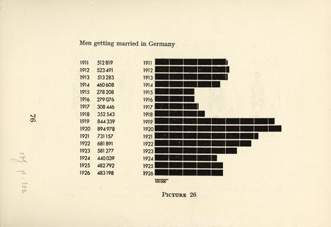
a
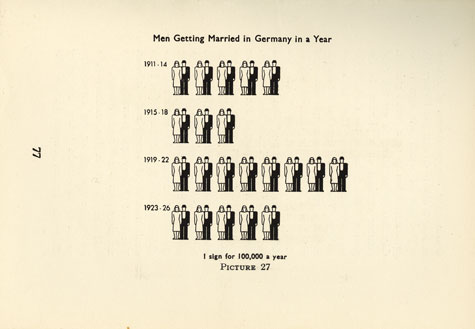
b
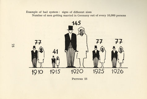
c
The Vienna Method and Die bunte Welt (CB)
Die bunte Welt (The colourful world) (figure 1, below), published in 1929, was the first book conceived, written and designed at the Gesellschafts- und Wirtschaftsmuseum in Vienna. It was also the first publication of charts made with the Vienna Method of Pictorial Statistics in which colour featured extensively. The book reflects the dual nature of the Vienna Method in producing material that could be understood simultaneously by schoolchildren and by adults with little formal education. Although Die bunte Welt is subtitled 'quantity-pictures for youth' (Mengenbilder für die Jugend), the graphic qualities and complexity of its charts are equal to those made largely for adult audiences. As the museum stated, 'its design makes it suitable principally for older children, in order to broaden their horizons and to awaken in them an interest in life's important questions.'
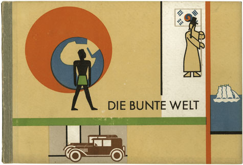 Figure 1. Cover of Die bunte Welt (1929), Vienna: Artur Wolf Verlag, 145 × 210 mm.
Not long after the book was published, Marie Neurath discussed Die bunte Welt in terms of workers' education. It was, she proposed, an example of how a body of factual information could be presented in a unified way, instead of piecemeal through various lectures and courses: 'The great advantage of these pictures ... is that they are more rapidly grasped than words, that they cannot be so easily misunderstood, that they stick better in the memory, and that they awake and leave a clear impression.'
Despite some surprising simplifications, the book's concise text deals with political and economic issues in a way that is still interesting today, even for adults. Its deceptively simple summary of world cultures moves subtly away from a Europe-centred point of view, and is driven by an inherently critical stance on western capitalism.
The graphic style of the publication shows the Vienna Method on the cusp of maturity, just at the point when the German artist Gerd Arntz was becoming more involved in the work. Several charts lack Arntz's clarity and precision (figure 2, below) when compared with others in the book that achieve an almost definitive form (figure 3).
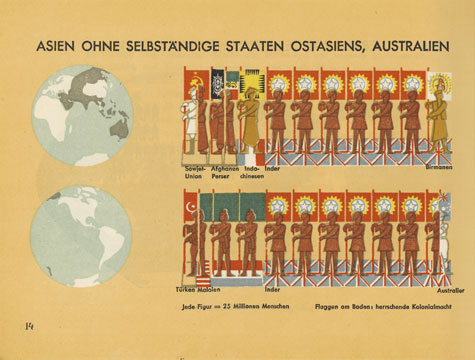
Figure 2. Chart from Die bunte Welt, p. 14, 'Asia (except independent states of East Asia) and Australia', 145 × 210 mm. This chart shows population by ethnicity. It appears to lack any significant contribution by Gerd Arntz, whose graphic style is not evident in the pictograms.
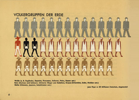
Figure 3. Chart from Die bunte Welt, p. 6, 'Human groups of the earth', 145 × 210 mm. Here Arntz's contribution is clear: ethnic differences are marked by distinct articulations of a basic form, without the intrusive background of national flags to cloud the images.
The Izostat Institute (EM)
In the winter of 1931 Otto Neurath and three colleagues from Vienna's Gesellschafts-und Wirtschaftsmuseum arrived in Moscow to begin a period of employment for the Soviet authorities. Neurath had agreed to help establish an institute for pictorial statistics in the USSR and to train Russian artists and technicians in the Vienna Method of Pictorial Statistics. The full name of the new Russian institute would be 'The All-Union Institute of Pictorial Statistics of Soviet Construction and Economy' (Vsesoiuznyi institut izobrazitel'noi statistiki sovetskogo stroitel'stva i khoziaistva) though it was usually referred to as the Izostat Institute. It existed from 1931 until 1940.
The two charts discussed below, both produced by the Izostat Institute, illustrate data on the provision of nursery places for children in the USSR and increases in the number of places available. While both address the same subject, each chart differs in the way it presents the data. These differences demonstrate the influence Neurath and his colleagues had on Soviet pictorial statistics in the period up to 1934, when the Izostat Institute terminated its contract with Neurath.
The first chart, 'Growth in capacity of city nurseries' (figure 4, below) is from a collection of sixty-four loose-leaf charts issued in 1932, in English and Russian language editions. The title of the English edition, The struggle for five years in four, makes reference to efforts to complete the 'First Five-Year Plan' for Soviet economy (1928-32) in four years rather than five. This particular chart shows the improvement in childcare in the USSR by claiming that spaces in city nurseries dramatically increased during the course of the First Five-Year Plan.
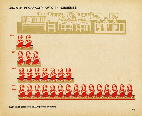
Figure 4. 'Growth in capacity of city nurseries', chart by the Izostat Institute, from The struggle for five years in four (1932), 185 × 250 mm.
Although this chart was published after Neurath and his colleagues had begun working in Moscow, its design indicates that the Izostat Institute was not yet adhering fully to the Vienna Method. So while the year range of the data is given on the vertical axis and the number of nursery places represented by each pictogram is clearly stated - following Vienna Method principles - the 'baby' pictogram itself is problematic. It is less appropriate for representing nursery spaces than a cot or a pram. The pictogram also stops short of pure representation by retaining naturalistic features in the baby's face and hair.
Elsewhere in the same chart, Vienna Method features were adopted with possibly secondary motives. This seems true of the illustrative scene of a Soviet nursery positioned along the top of the chart. Such scenes were termed 'guide-pictures' (Führungsbilder) by Otto Neurath. Their role was to help viewers understand a chart's subject matter, or to divide the chart into sections. According to Neurath, in a guide-picture 'only as much is shown as is absolutely necessary to the statement in hand.' In this chart, however, one could argue that the guide-picture also acted as propaganda by presenting an idealized image of a Soviet nursery with contented, well-fed children, uniformed staff, and decorated walls.
The second chart, 'Crèches' (figure 5, below), appears in The Second Five-Year Plan in construction. Issued in 1934 in English, the book reported on the progress of the Second Five-Year Plan (1933-37). Many of its forty-five charts show projections of how much progress would be achieved by 1937. Such assertions of future success were typical of Izostat charts. 'Crèches' thus shows the number of spaces in rural and urban crèches available in 1932, and that would become available by 1937.
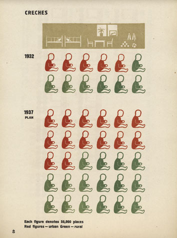
Figure 5. 'Crèches', chart by the Izostat Institute, from The Second Five-Year Plan in construction (1934), 340 × 230 mm.
In 'Crèches', the influence of the Vienna Method is immediately apparent both in the baby pictogram and in the guide-picture. All unnecessary detail has been removed from the pictogram though its meaning is still clear. Here, too, the use of colour is significant. Its does not carry a political message but instead gives information, in keeping with Vienna Method principles: red for urban, green for rural. In the guide-picture all the figures have been removed. No longer just a scene of nursery life, it now reaffirms that the chart is about crèches rather than children. Similarly, it no longer makes use of perspective (which the Vienna Method avoided), while the crèche furniture is fully in harmony with the pure representation of the baby pictogram.
Paul Rotha and Films of Fact (ME)
Between 1941 and 1947, the Isotype Institute collaborated with the film-maker Paul Rotha on documentaries sponsored by the British Ministry of Information. The films, produced by Rotha's company Films of Fact, dealt with themes relating to science, the war effort, and the Home Front. The Isotype Institute's contributions included scriptwriting and editing, and the design of charts, storyboards and other visual material. It also supervised the animation of charts made for each film, working with the production company Diagram Films.
One result of this collaboration was Total war in Britain, a twenty-minute film made in 1945 as propaganda for the American market. The objective was to publicize facts and figures assembled in a White Paper recently published by the British Government ('Statistics relating to the war effort of the United Kingdom', November 1944). By combining excerpts from existing newsreel films with nine animated charts, the makers of the film sought to translate statistics into 'flesh and blood, to communicate their meaning to the world outside in the language of human experience'. A jingoistic voice-over narrated the film while the charts punctuated its storyline and gave it structure.
The film begins with the outbreak of war in Europe and the air and sea battles above and around Britain. It then depicts the conscription of men and women, the production of munitions, and the effect both had on farming and land use. To illustrate these effects, animated sequences were devised by Marie Neurath. The sequences began as pencil sketches that were subsequently translated into storyboard pictures rendered in black, grey and white gouache.
An example of one sequence is illustrated here. It shows how agricultural land use changed in Britain during the war. In an early shooting-script, a commentary narrates the sequence: 'More plough land went under the plough, the cattle had to be supported by less. More food was grown. Land was needed for aerodromes. To make good this loss, wasteland had to be reclaimed.' In the same script, the intended animation is also described: 'Plough texture slides over, extending to new size on tracing. At same time cows [move] to new positions. 6 more wheat symbols fade in. Whole area of wheatland and grassland slides over, covering some of the wasteland. Plain grey area left behind. Aircraft appear on them, and airfield symbol on top.'
Two sketches indicate the start and finish of the sequence. The first sketch (figure 6, below) shows a field divided into three sections, each representing the proportion of land used for wheat and other arable crops, for cattle, and as wasteland (left to right). A line of farm-workers is shown below, tilling the land with a horse-drawn plough. In the second sketch (figure 7) the proportions of land use have changed: there is an increase in wheat/arable land, and a decrease in land for cattle and in wasteland. A new section of field has appeared (at left) for aerodromes. Beneath, the line of farm-workers now includes a 'land girl' and a soldier (white-outlined boxes, far left and far right).
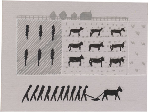
Figure 6. Sketch by Marie Neurath for Total war in Britain (1945), gouache on paper, 71 × 93 mm.
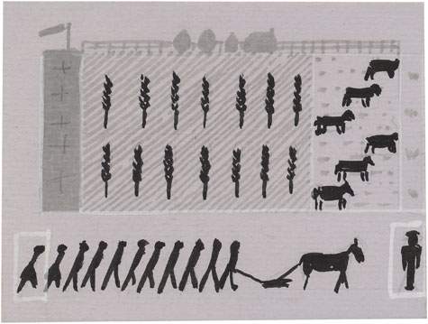
Figure 7. Sketch by Marie Neurath for Total war in Britain (1945), gouache on paper, 71 × 93 mm.
Two stills from the finished film show how the sketches were translated into the final animation. The first still (figure 8, below) is much like its matching sketch, though the pictograms for wheat/arable land, the land girl and the soldier are now more clearly delineated, while the plough is no longer drawn by a horse but by a tractor instead. As the field divisions together move from left to right in the animation, altering their proportion and introducing the aerodrome, the only significant difference in the second still (figure 9) from its matching sketch is the introduction of three airplane pictograms, set off against a now white field.
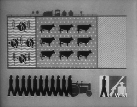
Figure 8. Still from Total war in Britain (1945), Paul Rotha (director) / Films of Fact.
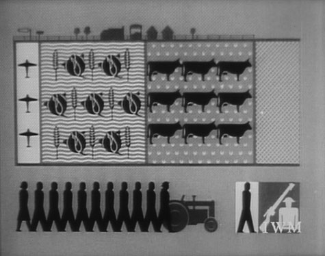
Figure 9. Still from Total war in Britain (1945), Paul Rotha (director) / Films of Fact.
Transformations from sketch to animated film sequence, like those shown here, are typical of the sixteen films that resulted from the Isotype Institute's collaboration with Paul Rotha. They offer insights into a relatively little known sphere of Isotype work made during and immediately after the Second World War.
Children's books (SW)
Otto Neurath began working on books for children in the 1940s, for the London-based book packaging company Adprint. Many of his ideas were drawn from his childhood experience and memories and from his views on visual education. He believed that children's learning benefited from pictures designed to encourage them to look, compare, and reach their own conclusions.
After Otto Neurath's death, Marie Neurath continued this work and under her direction, between 1947 and the late 1960s, the Isotype Institute produced many books for children in series, including 'Visual history of mankind', 'Wonders of the modern world', 'Visual science', 'The wonder world of nature' and 'They lived like this'. The books show Marie Neurath's remarkable contributions: her ability to identify unusual relationships between things and ideas, and to analyze and then synthesize complex information into bite-sized chunks. Her approach to making child-friendly visual explanations included teamwork, consultation with readers, and iteration between experts in a particular field and those making visual decisions.
If you could see inside (figures 10 and 11, below), published in 1948, was the first book in the 'Wonders of the modern world' series. The series was described as 'simple "how-and-why" books which will interest the youngest readers'. If you could see inside combines thinking about children's needs, and how, in transforming complexity through Isotype, language and presentation are closely linked. Its texts were written to relate to the pictures on a double-page spread, and to appeal to a young audience.
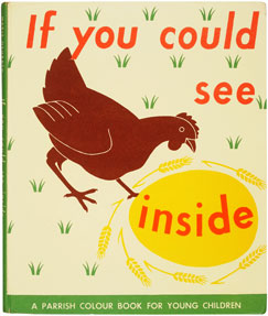

Figures 10 and 11. Cover and double-page spread from If you could see inside (1948), London: Max Parrish, 216 × 188 mm (single page), from the 'Wonders of the modern world' series.
The 'Visual history of mankind', a three-book series comprising Living in early times (1947), Living in villages and towns (1948) and Living in the world (1948) (figures 12 and 13, below) is an excellent example of explaining things from a child's point of view. Each book in the series is arranged in a sequence of twenty double-page spreads; each spread contains an Isotype chart and a list of questions, the answers to which could be worked out by examining the chart. The idea of 'generations', for example, is used to help a child relate to periods of history by referring to grandparents, great grandparents, and so on. Thinking of this kind led to the development of some powerful charts throughout the series.
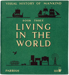
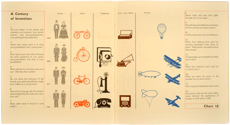
Figures 12 and 13. Cover and double-page spread from Living in the world (1948), London: Max Parrish, 216 × 200 mm, third book in the 'Visual history of mankind' series.
'The Wonder world of nature' series provided 'simple explanations of the strange things which happen in nature'. An illustration in Too small to see (1956) (figures 14 and 15, below) shows how colour, texture and shape help to explain how flies stick to and get unstuck from ceilings. Like the other illustrations in the book, the approach is 'through the magnifying glass', producing a double-page spread that is visually intriguing.
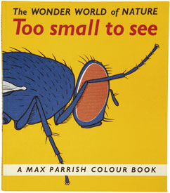
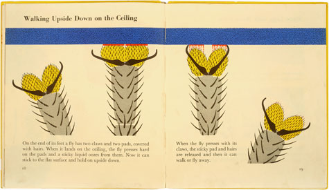
Figures 14 and 15. Cover and double-page spread from Too small to see (1956), London: Max Parrish, 216 × 188 mm, from 'The wonder world of nature' series.
Isotype in Nigeria (EK)
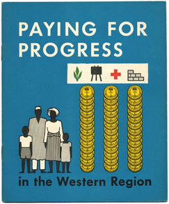
Between 1953 and 1958, the Isotype Institute worked on projects in the Western Region of Nigeria at a time when Nigeria as a whole was transitioning from British colony to independent nation (achieved in 1960). During this period, the progressive government of the Western Region was committed to a programme of social welfare and economic development. Among its goals were the introduction of free and universal primary education, the provision of health care for all, and the modernization of agriculture. To explain its ambitious programme to the people, among whom where many semi- and illiterate children and adults, the government turned to the Isotype Institute for help.
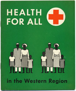
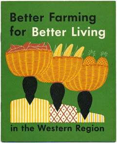
In 1954, Marie Neurath travelled to Ibadan in the Western Region to meet with government ministers. It was decided to design and produce a series of booklets in which 'problems, tasks and solutions were shown step by step' (Marie Neurath) for each area of the government's programme. Four booklets were completed first: Education for all, Health for all, Better farming for better living, and to explain how it would be paid for, Paying for progress (figure 16, a-d, below). Each began with a foreword by a government minister encouraging readers to contribute to the future of the Western Region by becoming better informed.
a
b
c
d
Figure 16, a-d. Covers for Education for all, Health for all, Better farming for better living, and Paying for progress (all 1955), Ibadan, Nigeria: Western Regional Government, 204 × 163 mm.
Throughout the booklets, one finds a variety of design and visualization techniques employed in support of this aim. Double-page spreads often function as narrative 'units': an idea or point is shown or made with each turn of the page, while facing pages present 'before-and-after' scenes and comparisons of other kinds, or give space for visualizing processes such as the flow of imports and exports, or the design of a building. A mix of views allows for spatial clarity: elevations and ¾-views, or scenes 'in depth' achieved though juxtaposition rather than perspective. Human figures are shown in ¾- or side-view (as well as straight-on, which was more typical for Isotype) and are busy at work, in school or at home; many physical features are naturalistic rather than abstracted. Native (Yoruba) attire, such as robes, wraps and headgear, is shown, but in places is mixed with western dress to suggest a professional class and a modern outlook. These and other features together enabled readers to identify with and understand what they were seeing and reading.
To ensure the booklets reached the greatest number of readers, they were produced in English and Yoruba language editions. Texts were first rendered in English then translated. The English was kept as simple as possible, in part to assist those with only basic reading skills, but also to facilitate translations into the vernacular Yoruba, in which certain modern concepts might be difficult to express easily.
These first booklets were followed by others that explained the work of improving roads, infrastructure and the water supply (figures 17 and 18, below), and that encouraged the spread of literacy, especially among adults. Another booklet, Registration and voting, explained how the people could empower themselves through their vote. The Western Regional Government was committed to universal adult suffrage and to the belief that the people should determine how the region moved forward and in what direction.

Figure 17. Double-page spread from Roads (1955), Ibadan, Nigeria: Western Regional Government, 204 × 163 mm (single page).
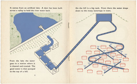
Figure 18. Double-page spread from Paying for good water (1955), Ibadan, Nigeria: Western Regional Government, 204 × 163 mm (single page).


